Description:
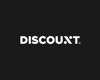
Logotype idea for Discount.
As seen on:
www.logopaul.com
Status:
Client work
Viewed:
14569
Tags:
discount
•
custom
•
logotype
•
brand mark
Share:

Lets Discuss
This is killer idea...
Replyfinally arrived here,,:D
ReplySuper fresh idea, haven't seen similar play with N!
ReplyIt's great work as always.
ReplyThank you guys for the comments. It appears that similar concept is already created http://drbl.in/kmTZ
ReplyClever idea!
ReplyWow,nice!
ReplyGood execution nonetheless. Why haven't I thought about this before?
ReplySmart work!
Reply^ Yep Smart.
ReplyGlad that you guys like it!
ReplyNice idea. The only thing that bothers me is the flipped % sign but I guess it is implied.
ReplyThanks Gareth, I flipped the sign because it looks more like 'N' in this way :)
ReplyFlat or Upto? :)
ReplyVery nice thinking! cheers!
great idea!
Replywow, this is superb
Replyalready been done
Replyhttps://dribbble.com/shots/1440919-Percent?list=users&offset=7
bang on
ReplyGreat twist on letter n to percentage symbol.great work
ReplyPlease login/signup to make a comment, registration is easy