Description:
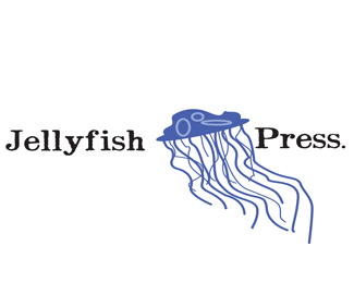
went with a type that looked to me like it could have been letter pressed, and add my illustration of a jelly fish, cartoonesque but thats how i like it.
Status:
Student work
Viewed:
674
Share:

Lets Discuss
I don't know where you got you font from, but the font looks like it has way to much detail in it. When you go to blow it up all those small details will be shown and I feel that it would not look very good. Try using a different font, or try to make it look smoother. I like the jellyfish, except it looks like a hat that has strings dangling down from it.
Replyi think the font is fine. but I'm a little debatable about the top of the jellyfish, they are still round on top it looks to much like a moon rock or something. i think if you round it off it'll be good!
ReplyI like the font, and I like the jellyfish tentacles. the one thing that really puts me off is the top of the jellyfish. it looks like a penguin laying belly-up on a rock or something. I say get rid of some points on the jellyfish top and make it seem smoother.
ReplyPlease login/signup to make a comment, registration is easy