Description:
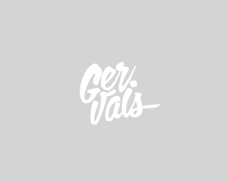
French DJ and producer.
As seen on:
mabu.dk
Status:
Nothing set
Viewed:
9686
Share:

Lets Discuss
Nice work on the fit and finish... me likes!
Replygood one
ReplyI love how you fit a scripty into a solid block. Visually dense and memorable.
ReplyVery cool
Replyricky gervais ! funnyest person alive ever since george carlin died...
ReplyTasty! I just checked out your site, great work man! And belated congrats on the feature.
ReplyThanks everyone! Cool Niel, your stuff is really amazing too.
Replythis flows so well!
ReplyReally like this Mabu. Think it looks better in Black though(due to contrast). Nice script.
ReplyNice overall feeling. What I noticed: The G seems a bit heavy and the %22i%22 reads like an l while it's dot seems to be period behind the %22Ger%22.
ReplyGreat, Mabu!
Replywicked! perfectly executed
ReplyWhere you%60ve been, man? Great type work as always, but gotta agree with Julian here.
Replya m a z i n g !
ReplyGreat logo, I think the font flows it as a whole, though one thing that I notice was it looks like Gar. Vals, after reading the title then it was the time I found out that it is Garvais.
ReplyI love it, did you do the Typo? : )
ReplyPlease login/signup to make a comment, registration is easy