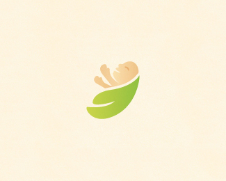
Float
(Floaters:
24 )
Description:
Baby emotions in organic / nature places. Love.
Status:
Unused proposal
Viewed:
10770
Share:


Lets Discuss
I see where you going buddy, but on my bright iMac (which are believed to be brighter than PC's) I can barely distinguish the baby. Just a bit of contrast. Also, I don't think the hands look ok. But a nice feeling overall.
ReplyHey, thanks Stelian. Hands corrected, as well as contrast I guess :-)
ReplyThank you AnthonyLane.
ReplyI always wear sunglasses, Tony, 'cause my work is too hot to handle without. B) I see a better contrast on my laptop, I agree - and I also think Milou added more contrast. And the new hands are sweet!
ReplyYep, contrast was corrected too Stelian! Glad you dig it! :-)
ReplyNice, gentle, mild, soft, pleasant logo, Milosz.*Quote(Stelian): I always wear sunglasses, Tony, 'cause my work is too hot to handle without. B)*LOL
Replyexcelent work. again. brightness is milou's friend, which is not bad. sometimes we don't need too much contrast to emphasize soft and gentle in logos. milou is creating and it's unique work, it's a style.
ReplyRoko, thanks a bunch buddy!*Claude, cheers for the great feedback, appreciate it a lot! :-)
ReplyAgain, great stuff my man!
ReplyCheers buddy! :-)
ReplyLooks great milou, I agree with myway999, you have certainly developed your %22own%22 style.
ReplyHere comes the update (see the logo).**Alexander, thank you very much for the kind words, appreciate it :-)
ReplyNice %3B). Agree with alex.
Reply...if is faded colours defined like someone%B4s style... then its VERY stylish :)
Replythis is great I love you cute style
ReplyCheers for the kind words fellas, though we went with another concept for the final :-) So it's going to unused proposals.
Replywhat a mass of great work ... **by the way ... thanx for commenting !!
ReplyNo probs you're welcome, and thanks for stepping by here as well!
ReplyThis made me smile, well done!
ReplyPlease login/signup to make a comment, registration is easy