Float
(Floaters:
65 )
Description:
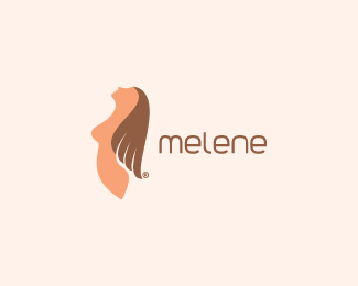
beauty studio. selfmade type. what are your thoughts on this?
Status:
Client work
Viewed:
14861
Share:


Lets Discuss
Nice but I'd probably downplay the boobage a tad. It could be a bit more subtle without losing the physique.
Replyboobage is good %3B)
ReplyBTW type is really good for mark.
ReplyI will consider this.%0D*thanks mates!
ReplyVery nice. I've always been a fan of your typographic work and this mark is great, as well.
Replythanks jared, I really appreciate that :)
ReplyI'm with Mike on both counts!
Replyhaha Joe, thanks!
Replynice mark, type too!
ReplyI'm glad you like it Andrei!
ReplyReally, really nice, love it!
Replythank you Sean!
ReplyNice client work!
Replythanks Peter!
Replyhi milou i'm curious to know where u from man !!
ReplyLove it!
Replyoh, hey sohnedesign, Houston-we is very smart guy, you should trust him about my location, where I'm living :D
ReplyAshley, thank you very much!
ReplyThe gentle curves of the mark match the type, good work
ReplyThanks mr Mark.
ReplyYou know, speaking of the female form...this is a great example of how to portray the most feminine aspects of a woman's body, without being vulgar, rough, or explicit. %0D*%0D*This is a smooth, flowing shape, with just enough detail to get the point across without going too far. If it never makes it to the gallery, I'll be surprised. It's a work of art, a beautiful execution on this concept.
Reply%5E Couldn't agree more with JF... This is one of my all-time favourite logos here on the pond. It is simply just a beauty... Just one thing i've always wanted to see, is the hair forming a %22M%22. It would be easy to do, but not sure how it would look :) Never the less, great great work!
ReplyHey, thanks JF %26 Alexander. I hope it really illustrate what you've said JF! I was trying few ideas on the m in the mark, but I wasn't satisfied with the effect, so I just turn on the hair how it looks now. And whoah thanks for the sweet words fellas! I really appreciate that!
ReplyMe too, love this one a lot.
ReplyThanks a lot Sean!
Replysexy
ReplyIt meant to be sexy, so I'm pleased to hear that mr T%F8mme. Thanks!
Replyi dated a girl that looked like her... nice mark
Reply%5Ean amputee? Nice work Milou
Reply%5E HAHAHAH
Reply@Logotivity, I'm really glad for you. Still dating her? Or you moved on to the next level? %3B)**@itsgareth Hahaha, yeh. Thank you Gareth.
Reply@Breno This is ain't that funny!
Replynice mark, type too!
ReplyThank you very much Norbi!
ReplyExcellent !!!
Replynice.
ReplyGreat to hear that fellas :)
ReplyI dig the colors too!
ReplyMuchos gracias amigo!
ReplyMy third comment on this one. Just love it. For many reasons. %3B)
ReplyHey Sean, thanks for the third stepping by, glad that you still dig this oldie! :-)
ReplyLovely creative mark
ReplyPlease login/signup to make a comment, registration is easy