Description:
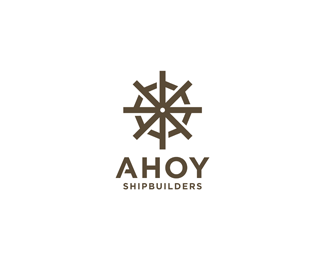
Logo for an imaginary shipbuilding company, named 'Ahoy Shipbuilders'.
Eight 'A' letters are combined to form a ship steering wheel. Due to this assembled character, the mark closely relates to the idea of construction.
Comments and critiques are more than welcome!
Status:
Just for fun
Viewed:
10298
Share:





Lets Discuss
nice and simple
ReplyThank you, Boris!**@Sam %26 Nick: appreciate the swimmers, if you have any thoughts/critiques on the design, feel free to share!
Replynice, have you thought about making the helm the same line weight as the 'ahoy' type?
ReplyIt might be interesting to make that cut in the Ahoy A, that you've made in the wheel A's. Otherwise it probably won't be clear about it being made of A's. I certainly didn't notice until I read the description.
Reply@Colin: Yes, I've definitely considered making the helm a bit slimmer, you might be right - will certainly try :)**@Sam: You're right, I presumed that the A's will not be easily recognizable. In my first attempt I've made the cut in the Ahoy A, but felt it made the name a little bit unstable and took some focus from the mark - this is why I ended up using the clear Ahoy textline.**Thank you for these comments, much appreciated!
ReplyUpdated: made the cut in the Ahoy 'A' vs initial simple 'A'.*So the question is with or without it?
ReplyI like it. With.
ReplyDefinitely with. It gives it much more dimension. Great work and update.
Replywith.
ReplyAppreciate the support, special thanks to Sam!
Replythats nice , it is just a matter of time for it to be galerised !
ReplyGood stuff, I love the letter %22A%22 too:)
ReplyCheers Roko and Julius, really appreciate your kind words!
ReplyYar! This be the one!
ReplyAmazing!
ReplyAhoy, love this logo %3B)
Replyexcellent work, man.
Reply@Sam: Yar, my friend! Again, thank you for your support!**@Nicholas, Ole and Cleber: Appreciate the kind words, it really means a lot :)
ReplyFirst time, I didn't understand). But when I looked closer... I have loved this sign) Cool.
ReplyVery nice!! Clever too! :)
ReplyCheers Alexander and Adrian!**Thank you all for the floats and the gallery spot - it really means a lot to me! :)
Replycongrats for being gallerized ... lovely piece of ID art ...
ReplyCheers, Bernd! Appreciate your words!
ReplyHey! Very good work... Could we talk about the %22just for fun%22?
ReplyHey Zsolt,*I%B4m not sure - did you receive my message?*Regards!
ReplyHello,**I've read it and have already sent you a reply last night :)**Regards,*Zsolt
ReplyI've only received one letter from you. If there was a second one, please send it again to the above mail address.
ReplyGood work*
ReplyThank you, Sergo!
Replyvery well!
ReplyThank you, Ljubomir!
ReplyPlease login/signup to make a comment, registration is easy