Description:
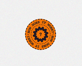
-WIP. Logo for an educational website. feedback is welcome.
As seen on:
Status:
Work in progress
Viewed:
1670
Share:
Lets Discuss
Good work but i think %22!%22 in center, might be better according to sense.
Replyis it just the optical illusion or is the %22?%22 tilted to the left a bit?
Reply@folkypaul: it's a client preference for now. but i will make some other versions too. *@megashred13: lol, yes. optical effect.
ReplyReally nice work, i have always been a fan of that rusty dark orange.
Replyagain, optical illusion. love this effect, though.
ReplyPlease login/signup to make a comment, registration is easy