Description:
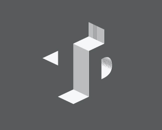
Architecture Logo idea my brother asked me to come up with. Look at it as if the T is facing the left, and the D is facing the right. Pretty much fried my brain sketching this out.
© 2011 Nathan Trafford
Status:
Work in progress
Viewed:
13461
Share:




Lets Discuss
I can imagine that your brain is ready for a reboot after this, but still nicely done. It's good that you added the lines to the design. That does nail the architecture part on the head.
ReplyWow...once you're able to wrap your mind around it, it's amazing!
Replymuch thanks, friends.
ReplyWow! Great use of negative space and such!
ReplyI'd love to see this with flat grays instead of the lines, but it's awesome regardless.
Replythankya thankya. I got a grey version i'll upload for ya, dtf, though it's important to me that any logo work in one color
ReplyVery nice Illusion !
ReplyBreak your senses...totally (:
Very nice Illusion !
ReplyBreak your senses...totally (:
Please login/signup to make a comment, registration is easy