Float
(Floaters:
56 )
Description:
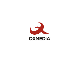
content management...unused concept for QXMedia...
Status:
Unused proposal
Viewed:
9714
Share:

Lets Discuss
final can be seen here... %22click me%22:http://logopond.com/gallery/detail/95156
ReplyNido, I think the client made the wrong choice on this one. This version is awesome. Nicely done!**
ReplyStrong mark.
Replythanks guys... it was a tight call... and I guess in the end they chose what they believed to be the stronger of the two...
ReplyVery nice nido.
ReplyThis is definitely the stronger of the two. I like that the mark shows a Q, X, and a bird. Pretty neat, man.
ReplyHey I didnt saw the bird! I also think that of these two this one is stronger. But also I think that mixture of these two could produce even better result. I mean the main quality of the other one is usage of negative space inside the elipse and this one's quality is the shape itself.*So how would it look if you put this one into negative?
Replystrong stuff nido. both of them.
Replythanks guys... it's interesting to hear your thoughts...
Replycan you hear my thoughts?..because I didn't even think anything yet
Replyyou dont wana hear what im thinking right now buster!...
Replywow fantastic!*
Replythanks Alex...
Replythis is far better than the other one. Pity they didn't select it.
ReplyHey, I missed this, that's very cool, Nido.
ReplyGreat mark here :)
Replyalways liked this:)
ReplyEverything's already been said, so I will just float and fav it :)
Replyclever execution.
Replythanks all... hope you all had a good weekend.
ReplyGreat mark!
ReplyPlease login/signup to make a comment, registration is easy