Description:
wip...
As seen on:
charge
Status:
Work in progress
Viewed:
13544
Share:

Lets Discuss
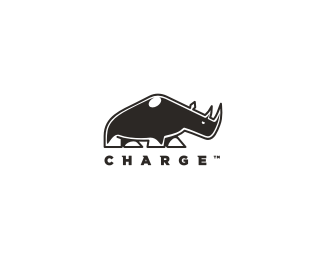
great balance between the mark and logotype, love the mark though was thrown of by the little highlight at the top, still, great work. That type a scratch one? Love the little serif of it, kinda like a speed line... adds a little motion to it.
Replythanks mac... still a wip, so not sure about the highlight on the top, keep flicking between having it and not... also working out whether needs more colour on the legs... as I said... wip..**the font is actually gotham... tweaked some :) .. thanks again bud...
ReplyTop rhino is energy (this is great), but the lower part is very quiet. Especially the rear legs...
Replysweeeet!* love the style to the rino, very strong image. very nice, nido.
Replystrong mark
ReplyYeah, it looks amazing!:)
Replyyou are so good with animals **do you have any pets
Replythanks all... sincerely :)**@bigoodis, I have a version where the legs seem more %22animated%22 but felt this %22quiet just before the storm%22 look said a lot more :)**@Raja.. lol... if I do have pets I can't recall where I put them...
ReplyYeah, looks like he's about to turn something into paste. Nice!
ReplyAs already mentioned, I think the highlight is only distracting: because it's (compared with the eye) huge, in the middle and at the top so it seems to demand all the attention.
Replylove the mark
ReplyHonestly, that highlight is a great touch. Looks perfect to me, I wouldn't charge anything.
ReplyThe light work on the feet and the little touch on the shoulder helps give the illusion of %22bulk%22 and dimension. I'm sure Nido could have gone for sheer simplicity here but the outline and light work takes it to another realm of design, but yet it's still simple. It's a very neat mark.
Replyreal strong. it charges alrite!
ReplySweeet!
Replythank you all... individually and collectively...**@Sean Heisler... I'm impressed by your interpretation of my design... well spotted and played.
ReplyI think changing the angle of the rear right leg would improve the sense of coiled energy you mentioned. Otherwise I think it's a really great concept.
Replysweet mark man
ReplyI dig the mark and think it it is close to finished, but what is messing with me is the light source for the highlight is different on the legs vs the one on the back. If you can figure out how to make the legs look the way you want and maintain a consistent light source, it might help. You could also shape the top highlight to give the top of the shoulder some more tension.
ReplyNice mark, and I'm glad to see you customized the type.
Replythanks
Replyi love this mark...im not too fond of the highlight on the shoulder, i wondered what that was when i saw it in the gallery.
ReplyI like the character and the type work. Great. What else can I say? (-:
ReplyBest Rhino I've seen in a mark in a long while! Nice one Nido
Replyvery kind of you all to chime in with your opinions and thoughts.. appreciated...**@Rokac... lol!.. I just saw that now.. good stuff.
ReplyLove it. Nice job :)
ReplyThe type fits so well with the mark!
ReplyTop notch mate. As is the rest of your portfolio.
Reply%5Ethat's SO true...
ReplyPlease login/signup to make a comment, registration is easy