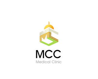
Description:
for a medical clinic open to all, that promotes friendly relations and understanding between the Muslim community and the general public, and to disseminate information on Islamic principles... v3.. & last
As seen on:
Status:
Nothing set
Viewed:
4042
Share:


Lets Discuss
is it cause it dont look like a 'C' the way it is now?
Replyhhhmmm... not bad... thanks :)
Replyi think i prefer this to the 'moon' version. it feels more balanced.
ReplyI'm liking this one too, Nav. Do you even need the green 'C'?
Replythanks guys... @Kevin... the green 'C' is the third 'C'.. do you think i dont need it? wouldnt it look like 'MC' then?.. plus the reason i had it green was cause the top two letters (goldish color) are what the building kinda looks like... the bottom 'C' in green represents the grass... outside the building... but i like climax idea... im waiting for the client to comeback now as ive submitted these now.. %26 then perhaps use his suggestion.. unless you got one too :)
ReplyI dunno, just talkin...maybe the 'MC' can just stand for Medical Clinic. I mean, afterall, the icon is the medical clinic so I think that would make sense. I also think the negative space might create some new interest. Not sure if it'll even work. I just like to talk a lot. :-P
Replyyou sure do %3Bp
ReplyHey, they don't call you Doc Oc for nothin!! :-P
Replyi thought that was from spider man?
ReplyIndeed. With my extra arms, I can type real quick.
ReplyPlease login/signup to make a comment, registration is easy