Description:
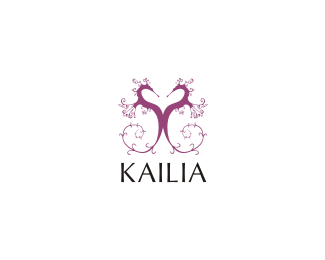
WIP... for eco-style shoes manufacturer... im really looking for feedback on font suggestions.. thanks
As seen on:
Status:
Nothing set
Viewed:
8141
Share:


Lets Discuss
nido, i like your seahorses,very unique. How about IMPACT? lol%0D*no what about all lowercase with a whimsical a's?
Replyhhmmm... not a bad idea logomotive... impact.. hmmm
ReplySuperb! So unique and stylish!
ReplyI think you should use a purple serif font. Cause this logo gives you a classic feeling, and it has thin lines (the serifs). Or maybe a kind of curly letter, but readable! Let me know when it's finished :)
Replydefinetly comic sans %3B)
ReplyThis looks great even at small scale bud. The detail is not lost. This font was much better than the one you showed me. Navmans on a roll!
Replyperhaps moving the mark away from the type will eleviate the optical of it being off centre ..
ReplyI'd say Copperplate. :-P**On a serious note, I love the illustration. Will you have issues at smaller size? There's a lot of detail.**Keep rockin', Nav!!
Replythank you guys.. all your suggestions have been greatly ridiculous :p.. apart from 'comic sans'.. the mark itself actually does quite well at a smaller size, though im gone have to change it quite a lot cause it will cause problems for embroidering... %26 i just learned that seahorses cant curl there tails back the way.. %26 kaimere is a font genius!!!
Replyjejejejej! Hey nido, well done men! i love the mark!
ReplyWhat about creating the heart with the tails?
ReplyHate to break it to you mate but:*http://logopond.com/gallery/detail/13505
Replykiddin... very nice, nido. The seamstresses' are gonna love you.
ReplyHey!.. daches seahorse is nothing like my tree!.. no a lots gona change on this before it gets anywhere a raging seamstress... but yeah im working on an upside down heart at the moment... actually im not, im off to play some football.. ill be working on it when i get back.
ReplyLol! Is it me, or has there been a mass breakout of sealife recently on the pond.
Replyit is a pond after all mate %3B)
Reply@smartinup: that looked kind of creepy. **but i like this one nido!
Replyfunny you should be putting a link up for that pic smartinup... thats the same pic the client sent me saying she really liked that!.. hey.. come to think of it.. ive never seen YOU %26 my client online at the same time!... hhhmmmm
Reply'go to a professional'... now why didnt i think of that!!!
ReplyI really like it as well. As for suggestions for the type, you may like 'Fling'. Whatever you choose, you should probably seek light, maybe scripty/curly, feminine types. (But, I think the one you used here sure may already be the right direction. Typewise.)
Replythis is compelling
Replyyou can solve those spacing issues in the type just spreading out the letters more
Replymy other comment got lost -**This logo is compelling
Reply@formloss.. thanks**@raja... thanks**@raja... thanks**@raja... yeah.. heard ya the first time!
ReplyWhat is the typeface? It's beautiful.
ReplyIs it peignot?
ReplyHey marcus... its called Optima
ReplyCome on then, let's see them seahorses!
ReplyPlease login/signup to make a comment, registration is easy