
Description:
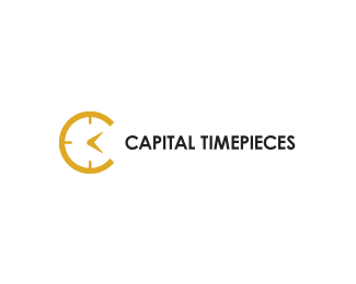
WIP. High-end watch dealer. Thanks for looking.
Status:
Unused proposal
Viewed:
11157
Tags:
flip design
Share:



Lets Discuss
I would try making the minute/second/hour hands to form a T.
ReplyI don't normally disagree with Joe but I think that if you change the hands on the watch, it won't resemble a 'C' anymore. I could be wrong but in my opinion, the hands are what make the letter. :)
ReplyAgree with Tabitha.
ReplyHi Joe - can you please explain why a T would be needed in this logo? I am just curious about your reasoning.
Reply%5EJust thought there was an opportunity to include both initials of the company name in the mark - seems like an easy solution to utilize all three clock hands to make the T - an abstract T of course.
ReplyNice work Wiking.***joe: Yes -- an easy solution -- you are right and 'opportunity'. Not some of the 'constants' in good logo design.**I think what I was more curious about, was what the initial problem you feel is and how convenience is a solution to that problem. Can you outline why logo this logo design should include a T for reasons other than the ones posted already and how it will be of help?**I appreciate your timely response.
ReplyI didn't think there was a problem - the mark is great. IMO it could be improved by the solution I suggested by simply referring to the company name in a memorable manner. Cheers.
ReplyThanks joe.**Can you substantiate your opinion as to how adding a T, as you put it, would not only improve but also, in the mind of the consumer, refer to the %22company name in a memorable manner%22. Any reasoning as to how this would work is something that will be of great help to the design community as we strive to learn the psychology of visual languages' correlation to language and names. Thanks in advance for your response.
Reply%5EI thought I made it clear what I meant, but maybe my words didn't come out correctly. If the company initials (CT) are in the mark, then when you see it there is a reminder of the name - of course none of this is relevant if the mark is never going to be displayed without type. But, in regards to including the T in the mark also, take a look at this one of yours: http://logopond.com/gallery/detail/857*Is it stronger because you have both initials included rather than just the M? IMO it is. It could be a personal preference.*Would the mark
Reply%5EWould the mark be less memorable without including both of them?*
ReplyHi Joe -***Thank you for your valuable knowledge. And enthused response times. Pardon my late reply (I was traveling overseas).****Also, thank you kindly for your personal reasoning as to why adding a T will remind consumers of 'timepieces' and improve upon this well designed icon.****However, asking me to have a look at my own -- totally unrelated -- work, deviates from this healthy and informative discussion on the cognitive sciences involved in effective visual communications for businesses.****To stay on topic, I feel your suggestion, in no way whatsoever, will be of any help with reference to the question that was posed.****The design community looks forward to more of your insight to help us all grow in a healthy and friendly manner.****Love,****- Raja
ReplyWow, didn't mean to start a riot :) Thanks for the feedback, comments and suggestions. After all that has been said here I feel compelled to give Joe's %22T%22 concept a whirl just to see how it looks. Thanks again all.
Reply^ interesting dialogue. cool logo.
ReplyI think raja was just taking the piss, these guys have all had 'encounters' that they have sense gotten over lmao.
Replynot much of a wow factor, but congrats on getting featured
ReplyWhat about making the two hands form a T? be C/T. Just a thought.
ReplyMikey? What are you doing? ;)
ReplyMan I miss this. Most I've heard Raj said all year!
How about doing the T with the hands, get rid of the 12, 6, 9 o'clock markers, and taper of the ends of the C. Choose a more refined possibly serif font. Despite the excellent concept, I just don't feel the 'high-end' aspect of it.
I agree with the sentiments of many in the comments. Using the hands of the clock form a 'T' shape would greatly enhance the logo. The 'C' element is already very prominent and I don't feel it would lose that strength if the hands were changed.
ReplyNooooooooooooo (Vader voice) leave it the way it is! lol
ReplyInsert humor here. Of course I don't think Joe's idea was all that bad to be honest.
ReplyMaybe could have thrown in a second's hand to the left and Everyone would be happy :)
ReplyI'm on the side of making the hands a T. :P
ReplyI will just say ... I like the concept, good job.
ReplyHoly smokes, go away for a day and come back to this :)
ReplyFirst off, thanks for the gallery add!! Totally unexpected.
Second, thanks for all the constructive comments and floats.
Third, this client has yet to pay for any of the creative work completed thus far and has been dodging me for quite some time. As for revising the logo, based on the comments above, I'll have to tackle it down the road, merely for my own personal satisfaction as opposed to pleasing this (insert profanity laced adjective here) client. Thanks again to all.
OK...updated version based on all the comments above. Ditched the 12, 9 and 6 o'clock markers as per Norman's suggestion. Cleaned up (changed) the font and added in the hands to form the T. Not sure if the addition of the crown (winding knob) is neccesary or not. Let me know what you think and thanks again for all the help.
ReplyHey...
ReplyDo you offer your service at fiverr.com too ? If no then it\'s sad that somebody is claiming this logo to be designed by him.
nice update the \'t\' isn\'t flagrant, makes a nice \'add\'
ReplyCheers David!
ReplyCan\'t seem to find the logo on fiverr.com. If anybody locates it I\'ll pay them 5 bucks :)
Please login/signup to make a comment, registration is easy