Description:
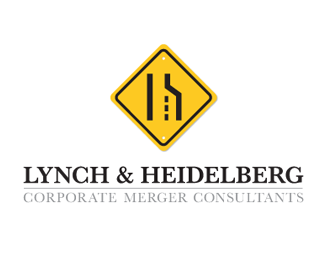
Corporate Merger Consultant company logo consisting of an "l" and an "h".
Comments welcome
Status:
Client work
Viewed:
2587
Share:




Lets Discuss
that is awesome, great job
ReplyGreat work.
ReplyClient must love it.
ReplyThanks for the feedback guys. To be honest with you that was a very %22demanding%22 client and we presented more logos than you could possibly care to imagine, all of which were shot down and I left the client presentation scratching my head. So there I am on the way back from the meeting, frustrated and stuck in traffic and I look out the window of the car and bingo!
ReplyTotally love it.
Replywiking, really creative solution, congrats. I initially thought it was too playful for a merger consultant firm, but hey if they like it, win-win for everyone!
ReplyVery clever. A refreshing mark for such a dry line of business. Congrats.
ReplyThanks mabu, gyui and sdijock!!
ReplySuper nice -- works on a lot of levels. Gains interest, captures attention...all the things you want a good logo to do. :)
ReplyThanks alldesign!!
ReplyThought I floated this a long time ago...dig it!
ReplyThanks Joe!!*
ReplyCan you use a street sign like that though? I mean can you really trademark that etc? I'm not being sarcastic I really don't know. Interesting concept.
Reply09 lol sorry, moving along
Reply@David - that one of the benefits (and frustration) of designing for a merger firm, tonnes of lawyers to double check everything. I know they had 2 lawyers look into the legal usage of the merge sign and apparently it was ok'd.
ReplyBrilliant!! This epitomizes what a mark should be, simple, identifiable while capturing the essence of what the client does.
ReplySuch a great feeling when that perfect idea hits, huh?? That's what I'm chasing. ;-)
Thanks Stephen!!
ReplyPlease login/signup to make a comment, registration is easy