Description:
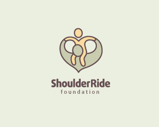
Logo for a charity foundation which focuses on promoting better fathering quality for children. Trying to create an asymmetrical heart shape by tweaking the classic shoulder ride pose. :)
Status:
Work in progress
Viewed:
14824
Tags:
kid
•
child
•
foundation
•
fathering
Share:

Lets Discuss
this is a nice idea although there is something on this that i cannot feel... just want to help and share my opinion. maybe less abstract and more personal and identifying the father son relation. also the colors and the hand connection could be more live. imo. :)
ReplyThanks t-sovo, really appreciate your input! :)
ReplyWith this logo will take you in the cross-fire of criticism, there are sure to see the sexy top and even pedophilia.
ReplyAnd so, the graphics would be fine.
: (
It`s a great concept, but as guys above mentioned, there is something odd and weird about the overall look going through the whole design. One of the things that throws me off is that it looks like some really weird face (holes between two figures being eyes) and with those legs hanging.. i don`t know.. :) I`d try to work more on it.. The child also feels naked using only one color.
ReplyBoy I'm just not seeing any of the negative connotations as the guys above do. I think it works quite well.
ReplyI love the feel of it and agree with the boom ... great shot this one !!!!!
ReplyI think people will get Deadmau5 associations from this when you convert it to black & white. Like the idea though, but not sure if it works this way.
ReplyYeaaaahhh....for me it is great!.....:)
ReplyHaha, thanks a lot for all the input guys. Really appreciate all the criticism as well. :)
Reply@Wizmemark: yes we also knew about the weird face thing (the insect-like face was a big issue when we did this logo). But in the end we went ahead with the mark because we thought that the \'face\' was less visible after coloring the shapes with subtle colors.
For me it\'s beautiful! Love the mild feel of it!
Replyaww that is so cute
ReplyMuy bueno. Felicidades
ReplyPlease login/signup to make a comment, registration is easy