Description:
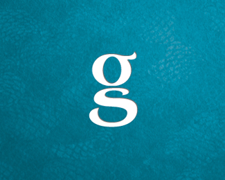
Still a work in progress, a logo for an indie animation studio called 'Ghostly Studio'. Anyone seen this concept before? Any input would be greatly appreciated! ;)
Status:
Work in progress
Viewed:
7161
Tags:
monogram
•
typography
•
ghost
•
studio
Share:
Lets Discuss
not bad ... not bad ... ;D
ReplyAWESOME! :D
ReplyThanks guys! :)
Replyclever cookie. this works so well. At no point am i pushed to make the connection.
Replylove this, great way of using initials in a clever way and aesthetically works well
ReplyInteresting concept
ReplyVery simple, clever concept. I don't think I've ever seen anything like this before, and if it *does* exist, I can guarantee that conceptually, it goes no further than simply combining a G and an S. In your design, not only have you combined a G and an S, but you also go a step further, by suggesting that the resulting shape resembles that of a ghost. That's pretty unique.
Reply@ atomicvibe: Thanks mate, appreciate your comment! :)
Replyyour work is very clean ��Congratulations!!
Replyunfortunately I\'ve seen it before: http://logopond.com/gallery/detail/36507
ReplyPlease login/signup to make a comment, registration is easy