Float
(Floaters:
38 )
Description:
A proposed but rejected design. Oh well.
Status:
Nothing set
Viewed:
9589
Share:



Lets Discuss
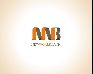
Clever, clever, clever. One thought, though. The icon is very overpowering in relation to the type. You still the man, CHAN!!! LOL!! What about a bold serif font?
Replychan 'ya make me want to be a better graphic designer'...but will stop designing nice logos yer making me depressed!!!!!!!! Agree with Kev on the type...great mark...yes Chan you is the man...
Replystrong mark, not so strong type! i like the color shift from the usual blues and reds.**Nice work!
ReplyDamn! I guess thats why it was rejected. Aligning the tyoe to the mark is one of my bad habits : (%0D*%0D*Thanks anyways guys.
Replyoh well.. hey maybe if you change the 'B' to an 'O' we can make ourselves some t-shirts %26 start a mutiny on logopond...
ReplyVery nice and very strong. Screw the client!
ReplyChanpion - I'd like to discuss hiring you for some design work. Please get in touch with me at mdavis@sleepwiththefishes.com**Thanks,*Michael
ReplyPlease login/signup to make a comment, registration is easy