Description:
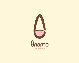
A letter “G”, an upside down ice cream cone and a gnome’s head with his typical hat, this all-in-one mark is the image of a new ice cream brand that will offer an extraordinary variety of ice creams and desserts for everyone in each of its one-of-a-kind shops.
Delight yourself inside this delicious village of creamy textures and sweet flavors!
2009 © José Manuel Contreras
Status:
Client work
Viewed:
6612
Tags:
cafeteria
•
rastaurant
•
food
•
coffee
Share:

Lets Discuss
very creative and well executed image and type. This should sell fast. %3B)
ReplyThank you very much coy. I hope it does!
Replywhat about a lowercase g? the lowercase g allows for a cone to be right side up and you can say the lowercase g looks like a gnome's head with a beard. %0D*%0D*agree with climaxdesigns about using a different g for the type at least.
Replyabsolutely what climax said
ReplyThank you very much for your comments and feedback.
ReplyI love this a alot, but I quite agree with wat gyui said. great stuff none the less.
Replymucha creatividad, pero en verdad la g del nombre podr%EDa cambiarse.
Replyme like
ReplyPlease login/signup to make a comment, registration is easy