Description:
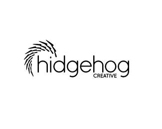
My first logo here on Logopond and would like some criticism or tips on improving.
I've added a new row of spikes and more consistency in the colors. Made the top row of spikes brighter to give it more energy and movement.
Status:
Nothing set
Viewed:
1827
Share:
Lets Discuss
solid design, and i like the coloring.. i dont have much to criticize on, but if i was going to say anything it would be about the consistancy of the spikes on the logo, they dont follow a specific pattern size wise. i would work on them being a gradual step down in size each new row of spikes.. Just a thought.%0D*%0D*great work!!
Reply%5Eagree with DeathRightz about the spikes. I love how the %22eye%22 of the hedgehog is the dot! Nice concept!
ReplyLove it. Agree with DeatRightz and gyui about the spikes, but even without it it's effective and creative.
ReplyI appreciate the positive comments! I'm going to work on the spikes and perhaps some color alternatives.
ReplyExcellent concept and design! The hedgehog is bold and the whole logo is clean and effective. Nice work!
ReplyThis is a good execution and nice idea. I think the spikes have a weird effect when they overlap, but without the overlapping, it would not look like a hedgehog after all. *Anyway, a cool design. Congratulations!
ReplyThank you @D.Roark and @Zink!**I've been experimenting with spike placement and it's very tough. The slightest movements of the spikes can make it look like a different animal or make the hedgehog intimidating. I'm still working on variations of colors and what the logo should look like on various color backgrounds. Thanks for the feedback!
ReplyI've been meaning to ask, why hidge intead of hedge?
Reply@THEArtistT**I originally was going to make the name hedgehog but realized I wanted to give the hedgehog an 'i'. It makes the company name unique and the misspelled 'i' attracts attention.
ReplyGood reason. :)
ReplyPlease login/signup to make a comment, registration is easy