Description:
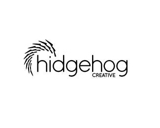
I wanted to try something different other than being so bold. So... I made it thinner. I think it works if I'm going for the sharper look. What do you guys think?
Status:
Nothing set
Viewed:
1222
Share:
Lets Discuss
It's just me again, but I kinda like the first version out of these three variants. Keep up the good work, and I would like to see your other works.
Reply@zink Thanks for your encouragement and comments. I'm torn between this and V2*
ReplyHi,**I really really dig this one. I like the spikes (more spiky here) and the the eye of the hedgehog being the dot of the i. Nice!**Suzan
Replyvery nice work, what font is that? love the colors, too!
Reply@itzsuzan**Thank you! I am really starting to like this one the most. I am able to keep the simplicity of V2 without it looking like a chunky armadillo.**@ice-horse**Thanks! The font is Kozuka Pro.
ReplyPlease login/signup to make a comment, registration is easy