Float
(Floaters:
40 )
Description:
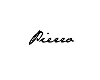
My personal logo, combining the "pen" and the letter "P".
Status:
Client work
Viewed:
3015
Share:





Lets Discuss
Thanks for floats guys! appreciate that.
ReplyNice work man. I would maybe make the pen a little more obvious, at the same time though I quite like the subtlety of it
ReplyThan2s Euan! I try it closer to the pen.
ReplyWhat was the last? Good or bad?!!!! %3B)
ReplyReminds me Pablo Picassos' signature some kind of way :)
ReplyThanks Gotty! %3B)
ReplyHey what's your real name Pierro? Very nice btw.
ReplyThanks Joe, Pierro is my first name (Pseudonym) %3B)
ReplyHi Pierro, **Did you created the wordmark from scratch or you've modified an existing typeface? I'm trying to design a handwritten logo by writing it on my own so it's more unique but I'm not quite sure how. Any tips? **Thanks! *
ReplyHi Michael, you can contact me through this: [email protected]
Replynice :o)
Replythx hussein!
Replygreat signature....love it dude, even I don't really see the pen. Fluidly nice :) Love it!
ReplyThanks! little careful to see pen. %3B)
ReplyPlease login/signup to make a comment, registration is easy