Float
(Floaters:
84 )
Description:
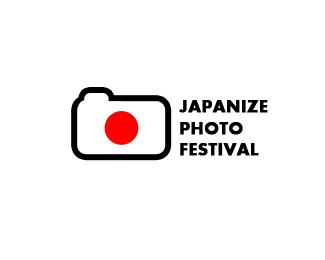
Photo festival in Tokyo 2012.
Status:
Client work
Viewed:
16448
Share:


Lets Discuss
nice! clean, simple but memorable :)
ReplyI think it might be spelled wrong, NO? Googled it so I did not look like an idiot and found no Japanize.
ReplyI would place there a regular rectangle japanese flag for a logomark. That would look really cooool IMO. So no shutter button, no rounded edges, only the flag! It still works for this purpose. What do you think?
ReplyJapanese?
Reply@Alex:lol, thanks.*@Mike: I remember you from when I started this site to work, a keen interest in others fuss found. It is better to replace criticism, this site provided a place for ideas and comments to improve the work.*and about this work, the word is Japanize customer. :)*@hyperborea: thanks buddy, I agree that the work is simple and less detailed, but customers wanted.
ReplyHey Sean! i explained to a friend. %3B)
ReplyPierro, it seems that you take criticism very badly. Are you going to offer an explanation for the spelling Japanize?
Replyok for a customer, but just make it a flag here and I bet it goes straight to the gallery :)
ReplyRoy, every work should be criticism, whether good or bad, I explained to friends already. :)
Reply%5E%5Ethanks man! I am familiar with policies of this site, but I hope so!!! %3B)
ReplyI don't understand what's all about. There are many dumber neologisms than 'Japanize' and besides that I believe @pierro knows better what name he should add to the mark. Personally I really like cam flag concept.
ReplyThanks friend for comment, this work has been approved, the customer has chosen the name and certainly has a reason.
ReplyChanged, not in festival but only here! :)
Replygood thinking JP!
ReplyCheers Riz! :)
ReplyI didn't agree with JAPANIZE spelling, but the customer so it was completely accentuated, probably has it's roots in history!
ReplyIs there a site for this festival? Is this logo in use?**And Pierro, it's likely your client doesn't speak proper English, and misspelled 'Japanese' -- there is no such word in English as 'Japanize'. **Either that, or you're having a hard time admitting you made a mistake in spelling, which if that's the case, you really shouldn't be that self-conscious. We all make mistakes. **This is a great design, very relevant work. Ties in well with the Japanese flag.**
ReplyThanks for gallery unspot! :))
ReplyOnly a web site that is not respect for their users, I'm sure had a personal reason to do so.
Reply@JF: Many words in different languages that you've heard, the reason is not to destroy the value of work, thanks for your opinion.
Reply@David: That's true, but here is my reference for the customer, the customer has agreed to do, I just put my idea, it wasn't interesting dude.
Reply@AnthonyLane: %22Japanize%22 does not mean for you? maybe the customer wants to choose an anonymous name.%0D*Thank you all friends for comments and floats. :)
ReplyPierro, please tell me: I do not understand why a Photo Festival would want to, or possibly could even entertain the idea of an 'Anonymous' name. I believe what AnthonyLane was saying was, he does not understand why anyone would intentionally spell it that way, as it makes no sense to him to do so. And, that was my point as well. Do you understand why we are wondering about these things? I believe English is not your native language, so perhaps there is something you are not picking up with our comments and questions. I say that was all due respect.
ReplyTypo -- mean to say in the last sentence...'with all due respect'.
ReplyMy native language is not related to this issue, customer demands was %22Japanize%22, the logo designed for a local photo festival, and they preferred to choose the name.
ReplyIt's OK Pierro. Let's move on now.**http://www.thefreedictionary.com/Japanize
ReplyThanks Roy, I initially did not agree with these discussions, some users consider their position that any comments they want, delete logo from gallery was not good.
ReplyJust chalk it up to a domain-name thing. Nice concept, Pierro.
ReplyJapan Eyes Photo Festival -- with two red dots ..**anyway, the concept is really interesting**
ReplyThanks mates. :) I'm glad u like it.
ReplyAgain I say David, your work isn't correct, I want changed logo every time, delete from the gallery is an insult to the users, but you don't mind.
ReplyStrangest discussion I have ever seen on here. Just sayin'
ReplyJapanize it, yo!
Reply%5E 1
ReplyUpdate it.
ReplyI thought the same thing, lumavine.
Replyand my head hurts..
Replyhttp://www.youtube.com/watch?v%3D7pshY7HfYS0
Replysorry Pierro, it is a nice idea. Just reminded me of that song.
ReplyHaha!...thanks guys, I appreciate it!
ReplyNow we're talking... Japanize. :)
ReplyIt's a simple but extremely effective design, I think it's great - and never worried/cared about the difference in spelling!
ReplyThanks all...@graphic-design: yeah I agree with you!! :)
ReplyVery Nice
ReplyTimeless logo design. Such a minimalistic master piece!
Reply%5Ehave to agree with that, very much in the field of Roy Firebrands Smith French Property Exhibition, an instant classic, so simple its genius. Glad this is back in the Gallery.
Reply%5E I think exactly the same Paul.
Replygood to have it back. still great work pierro %3B)
ReplyThanks a lot guys, Roy's logo is very durable!
ReplyGreat concept and the simplicity is also appealing.
ReplyHAHA...cheers my friend.
ReplyI think what really make this good is that its 3 things Simple, Relevant and Understood
ReplyThanks a lot!
ReplyThank you, you are all very kind. :%5E)
ReplyPierro, this one is so simple, but so cool :)
ReplyThanks superman!!
Replyclever work !!
ReplyThank you mate. %3D)
ReplyI think the festival concept is missed, but i love how japan and photografy make an interesting element, congrats!!
ReplyThanks a lot for the look
ReplyPlease login/signup to make a comment, registration is easy