Float
(Floaters:
5 )
Description:
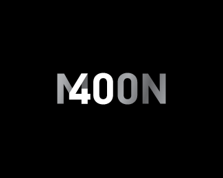
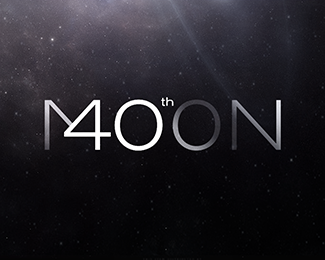
A logo to celebrate the 40th anniversary of landing on the Moon.
Status:
Just for fun
Viewed:
9953
Share:


Lets Discuss
I believe there must be a solution to mix the 4 and the M more smoothly. If you look at this for a longer time, you know that they don%B4t really match.
ReplyI appreciate your critique but it was always my intention to have the 4 sit on top of the M and not feel blended into it. Believe me, I've done dozens of variations to this, in all manner of fonts and angles and aligning the crossbar. This one feels the most natural to me, the only thing I was unsure of was whether to close the counter of the 4. But in doing so, I lose that layered on top feel, slightly.
ReplyVery nice typographic solution!
Replyvery nice indeed
ReplyPlease login/signup to make a comment, registration is easy