Description:
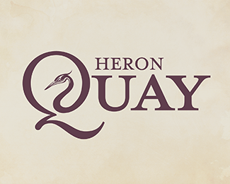
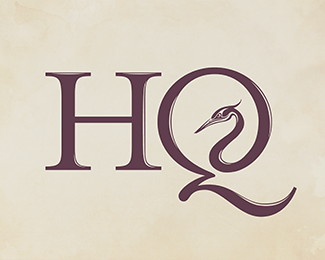
This is a work in progress so I'd very much appreciate any constructive criticism. Cheers. --- Heron Quay is part of the business district in Canary Wharf, London. It's very suit-n'-tie type of area, but also very scenic along the waterfront, also with that amazing traffic-light sculpture round-a-bout. --- I wanted to do a brand-identity for this financial district, as a personal project. The Heron is a very graceful bird with that iconic, elongated neck.
Status:
Just for fun
Viewed:
3512
Share:

Lets Discuss
Nice old school typography. My only criticism is that the detail in the heron would be lost at small sizes.
ReplyCheers for the feedback FB. I agree about losing detail, which is why I have a detailed heron in the 'HQ' logo and a nearly silhouetted heron for this logotype version at small sizes. :)
Replystunning piece of typography
ReplyReally nice!
Replyi like
ReplyPlease login/signup to make a comment, registration is easy